Mobile Friendly - space.com
http://www.space.com/Finding Content
Space.com content is fairly easy to find. The latest updates are always on top and then decend by category. Also at the top is a mobile friendly menu with a google powered search option."
Clarity of text, images and media
Images and text on Space.com resize themselves to a format that is easily viewable on a mobile phone. Headers and subtext are all legible, while images are clear and on banners, autoscroll so as to take up less space.
Navigation
Navigation is fairly easy, though the ads get annoying. Each clickable area is designed to be large and friendly for fingers. Each category can be reached by scrolling straight down the screen,where a small selection of articles are visible and then access to the full section is clearly marked.
Colors and layout
Colors are black, white, gray and navy blue. Layout is a verticle scrolling page.
Likes and dislikes
I really like the way it's easy to scroll through categories and that buttons are easy to hit without trying to be super accurate. I don't like the advertising system which often makes me scroll a full add up over the top of what I want to click on or read before allowing me to access the content I want.

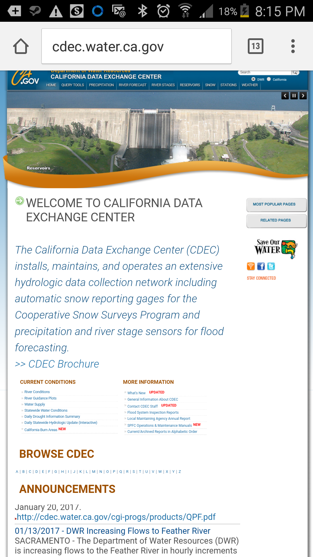
Mobile Unfriendly - cdec.ca.gov
http://cdec.water.ca.gov/Finding content
Finding content is a challeng in mobile because the page doesn't resize. While everything is there, you have to zoom in to see it.
Clarity of text, images and media
Navigation
Clicking links just isn't easy when viewed on a mobile device - its way too easy to accidentally click the link above or below your actual target because each link is too close to its neighbors.
Colors and layout
The colors really aren't bad here and could work if things were more mobile friendly, however the layout is clearly intended to be viewed on a computer screen and not a mobile which means it's impossible to read even one line without zooming in and scrolling side to side.
Likes and dislikes
Colors are nice and the data presented is very useful to a number of industries including agriculture, city management, flood watch and more. However, it's obvious they don't really do anything to cater to those checking the site on a mobile device which means that while you CAN view it, you'll spend a lot of time zooming, scanning for content and trying not to click the wrong link.